Sightbox Brand Refresh & Website
Client
SIGHTBOX
Agency
SIGHTBOX STUDIOS
Year
2022
Sightbox is a Brand Experience & Marketing agency specializing in helping startups and founders bring their visions to fruition. They have supported and launched over 100 startup and enterprise clients in various industries, ranging from apps to automobiles. The next generation of web technologies (Web 3) is rapidly changing the digital landscape, and the team at Sightbox are all in. It was time for the Sightbox brand to transform itself along with the new web.
The Challenge
The previous Sightbox brand was very bold, cheeky, and influenced by pop-culture. The brand was successful in many ways, however it was very 1-dimensional. The challenge would be creating a brand that retains the same spirit as the earlier version, but with more dimension.
The Concepts
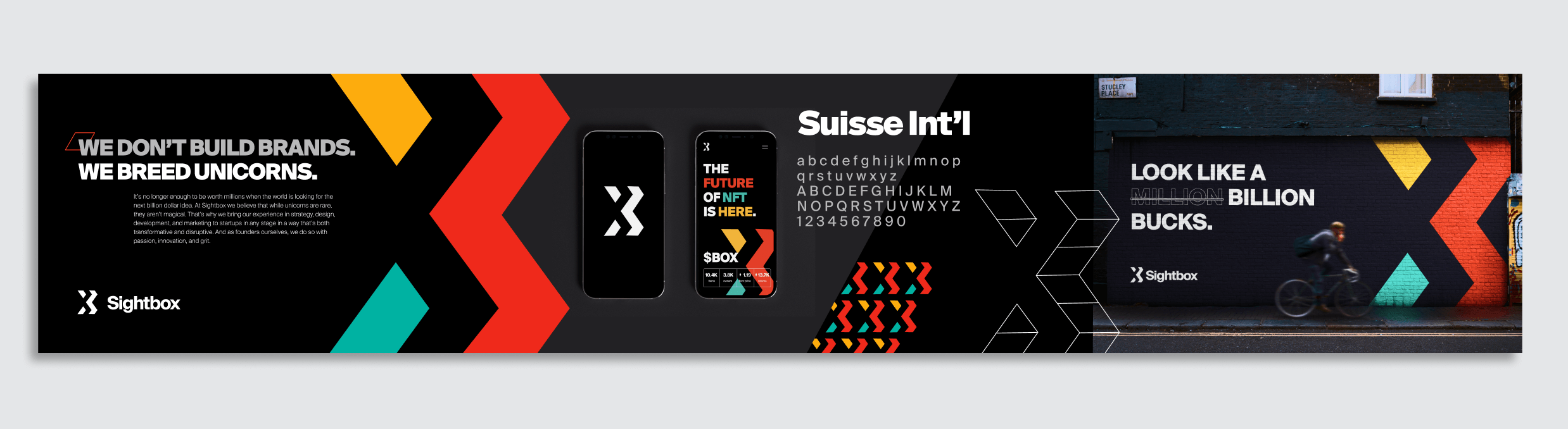
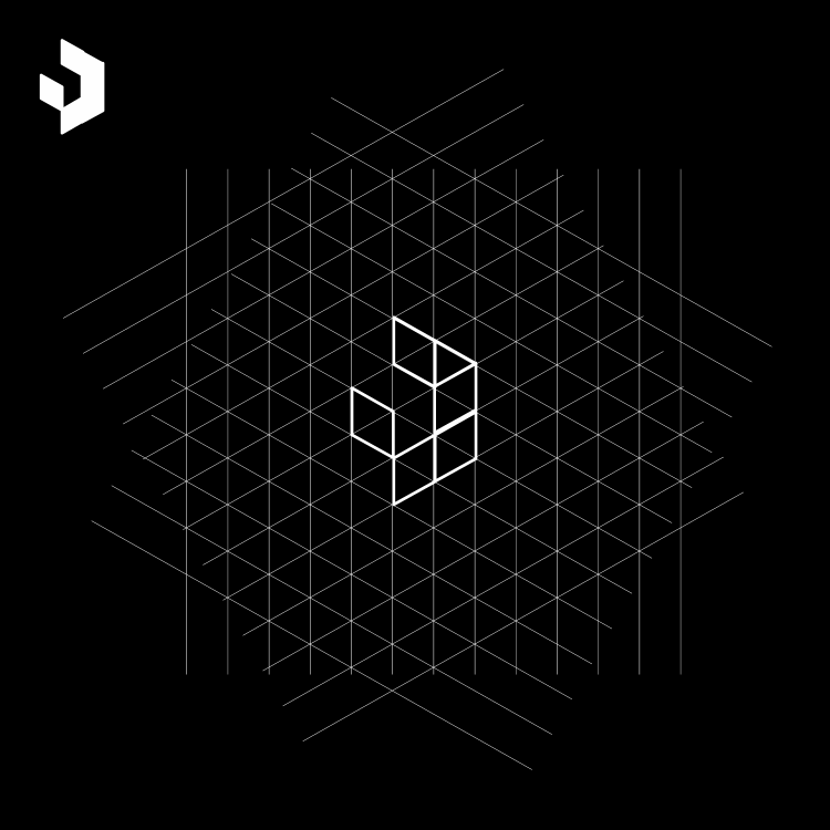
Concept .01/ Created an “X” logo mark using a grid to create depth and dimension. The “X” represents power and strength. Bold colours and typography.
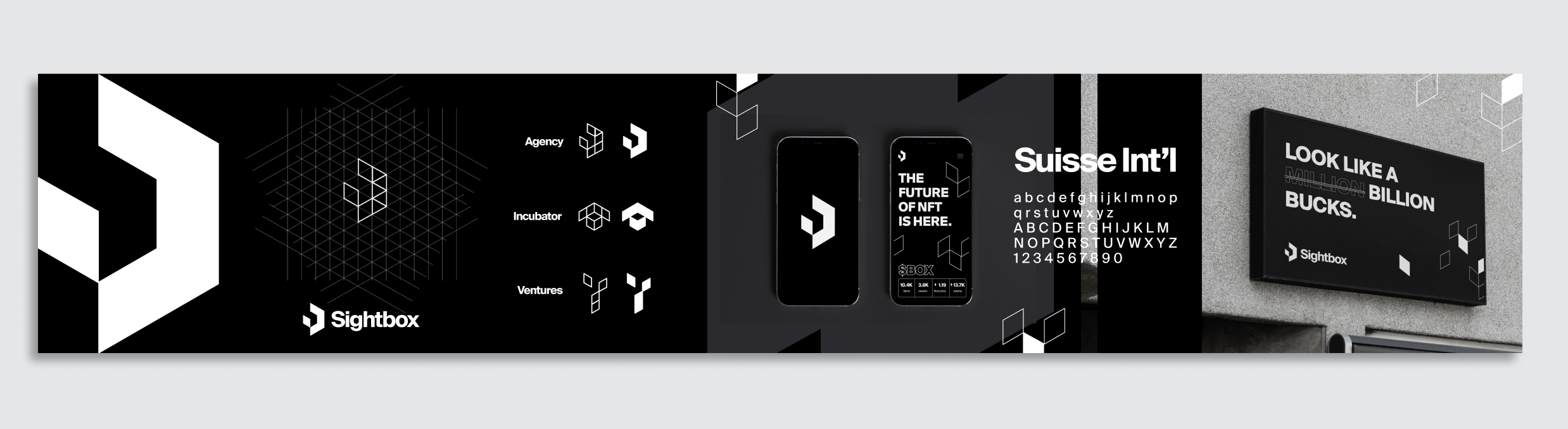
Concept .02/ Used the grid to create dynamic logos for each pillar of the brand -Agency, Ventures, and Incubator (Startup Studio). Black & white brand.
Final logo
Using my initial concept and grid as a base to build from, my fellow designer Andrés Soler Bíderman was able to create a version that blended an “S” with the dimensional box, successfully pulling together all of the aspects that we were seeking in the logo... the man’s a genius.
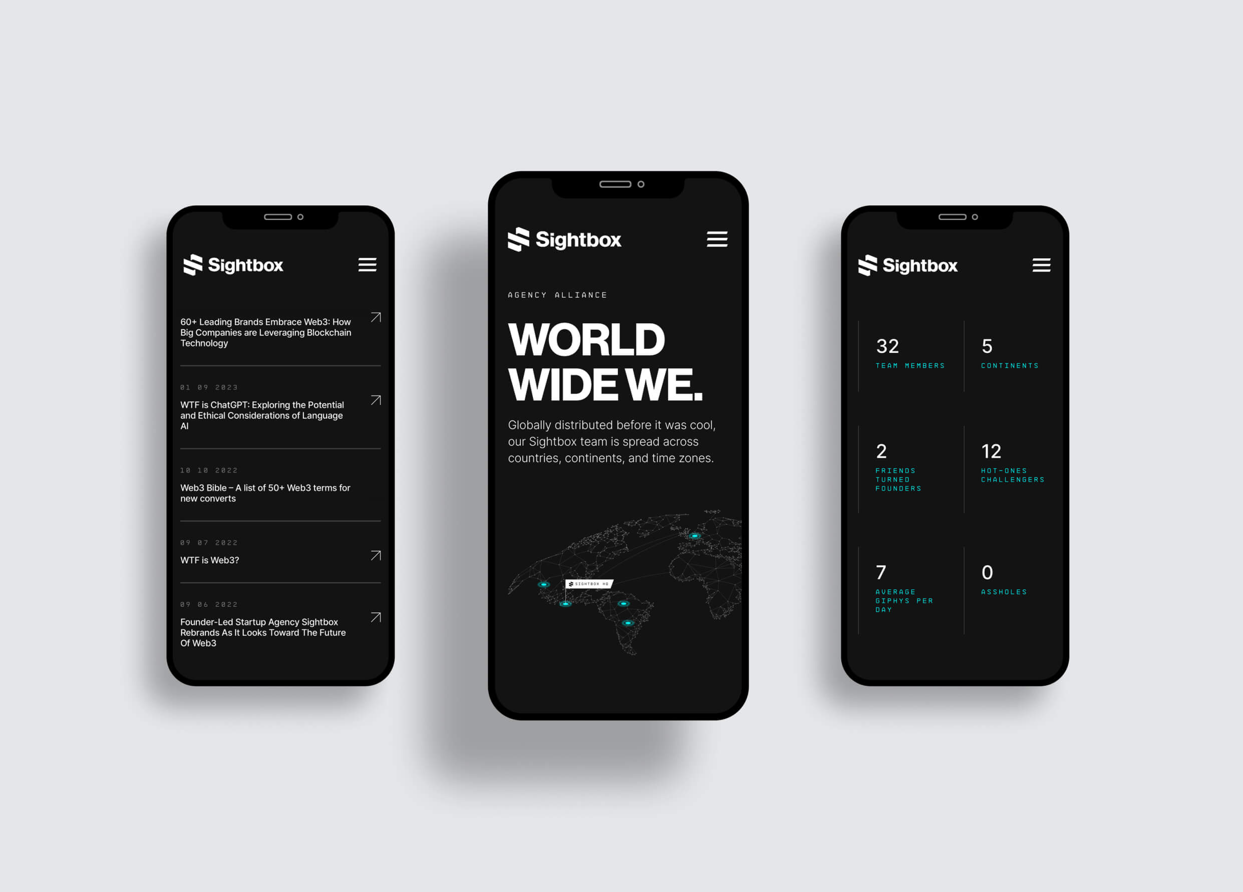
Website
Once the logo was finalized, I began to explore website concepts that would incorporate the logo along with the initial brand styles I had created earlier.
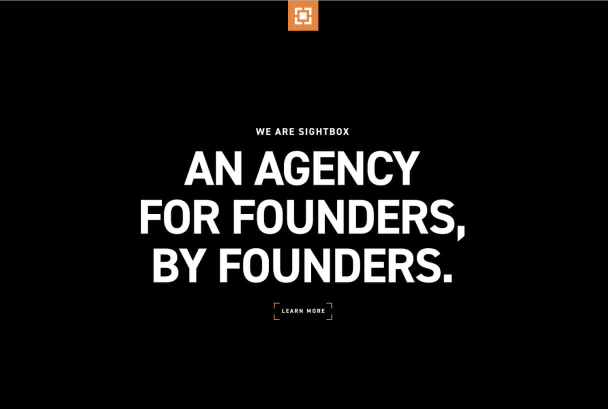
Homepage interaction that reveals the new brand initiative video through the new logomark.
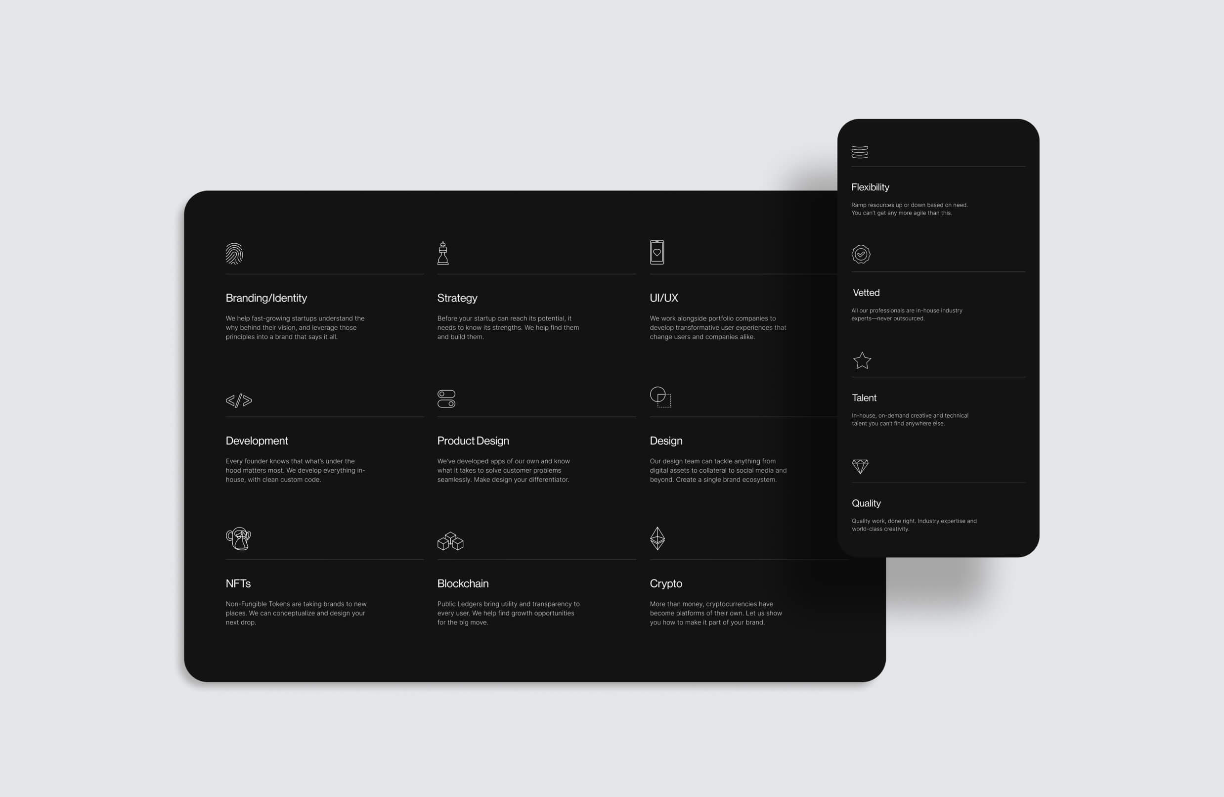
The three pillars of the main Sightbox brand. Each logo I created using the same underlying brand grid.
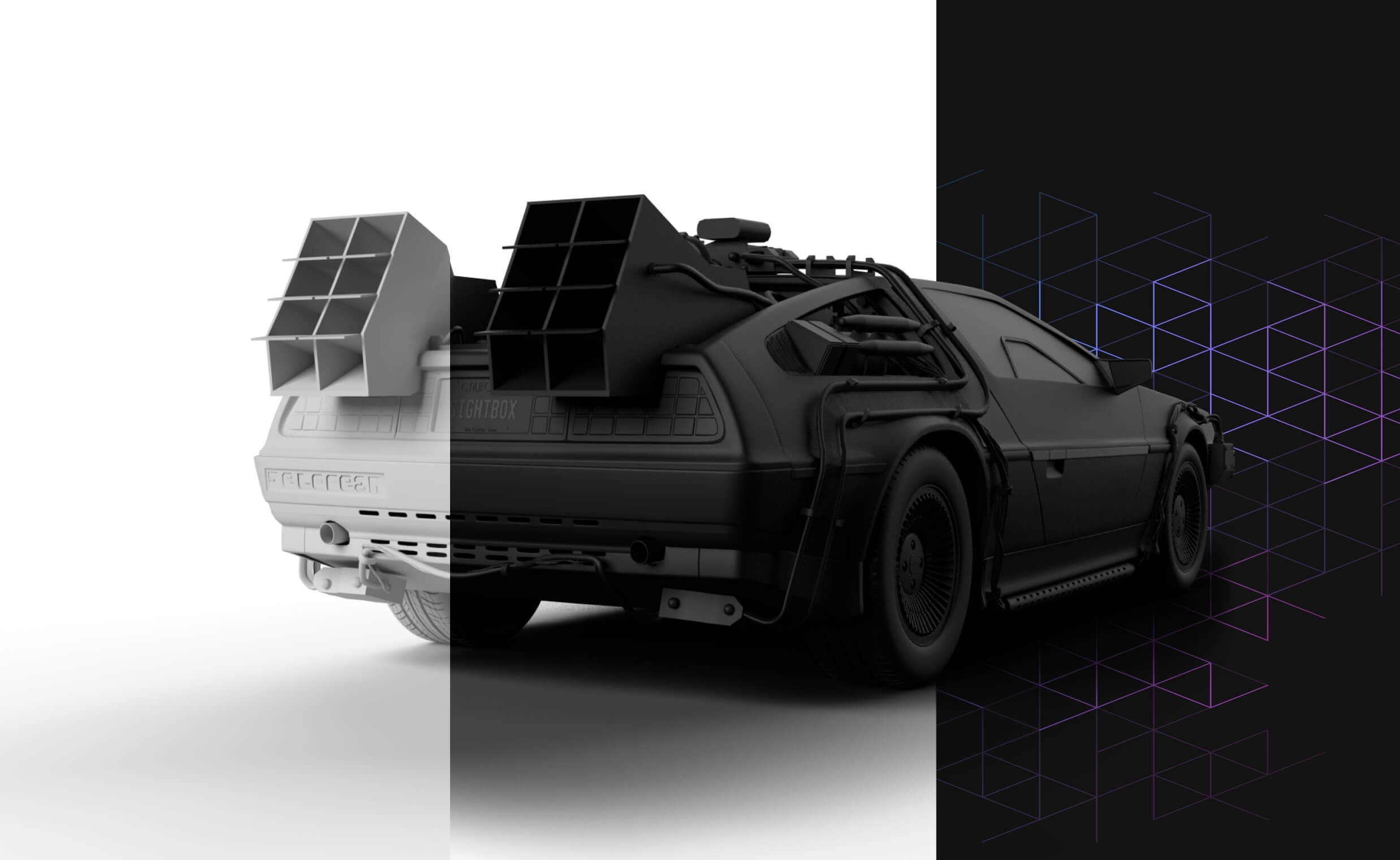
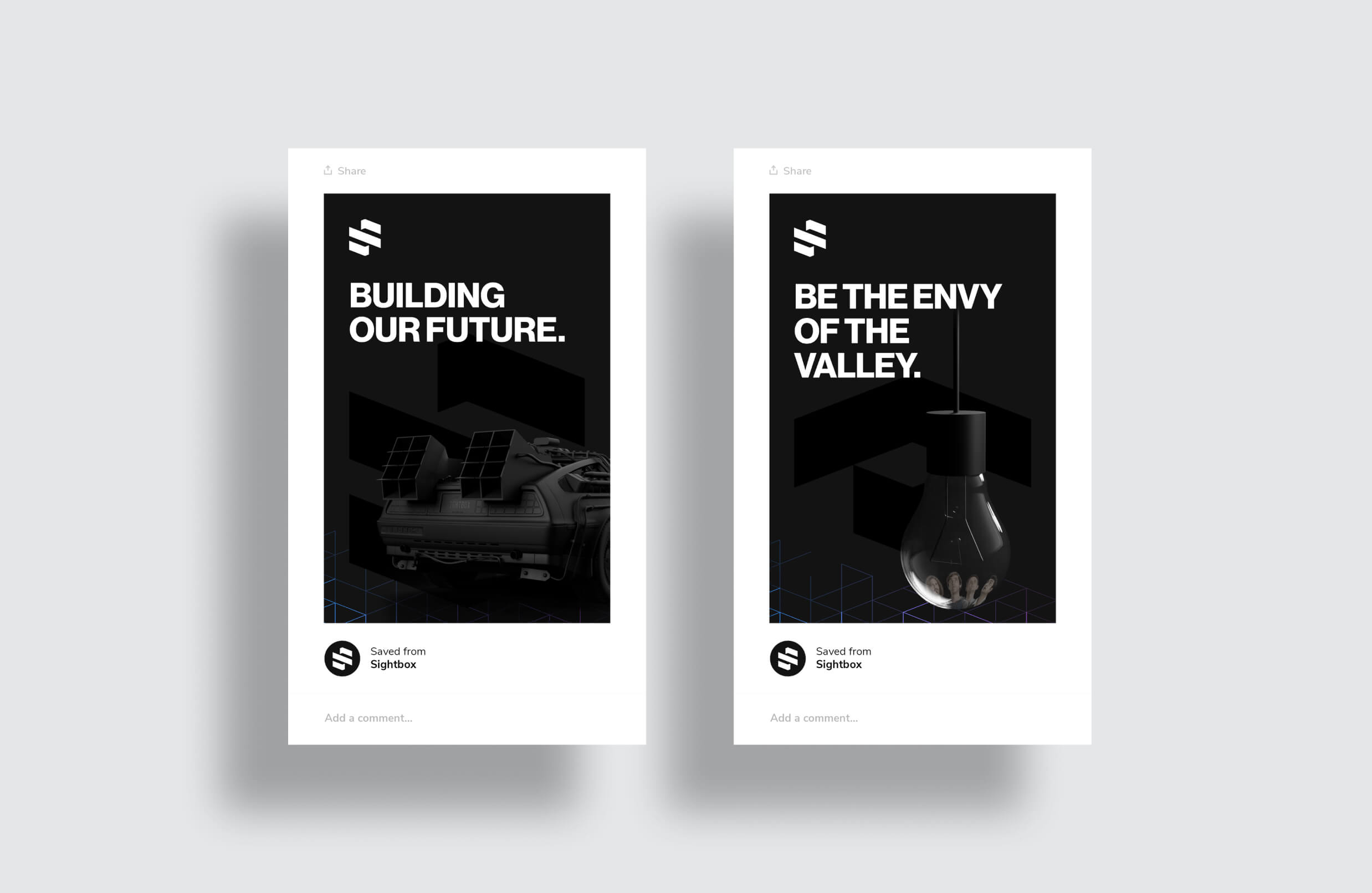
3D Rendering
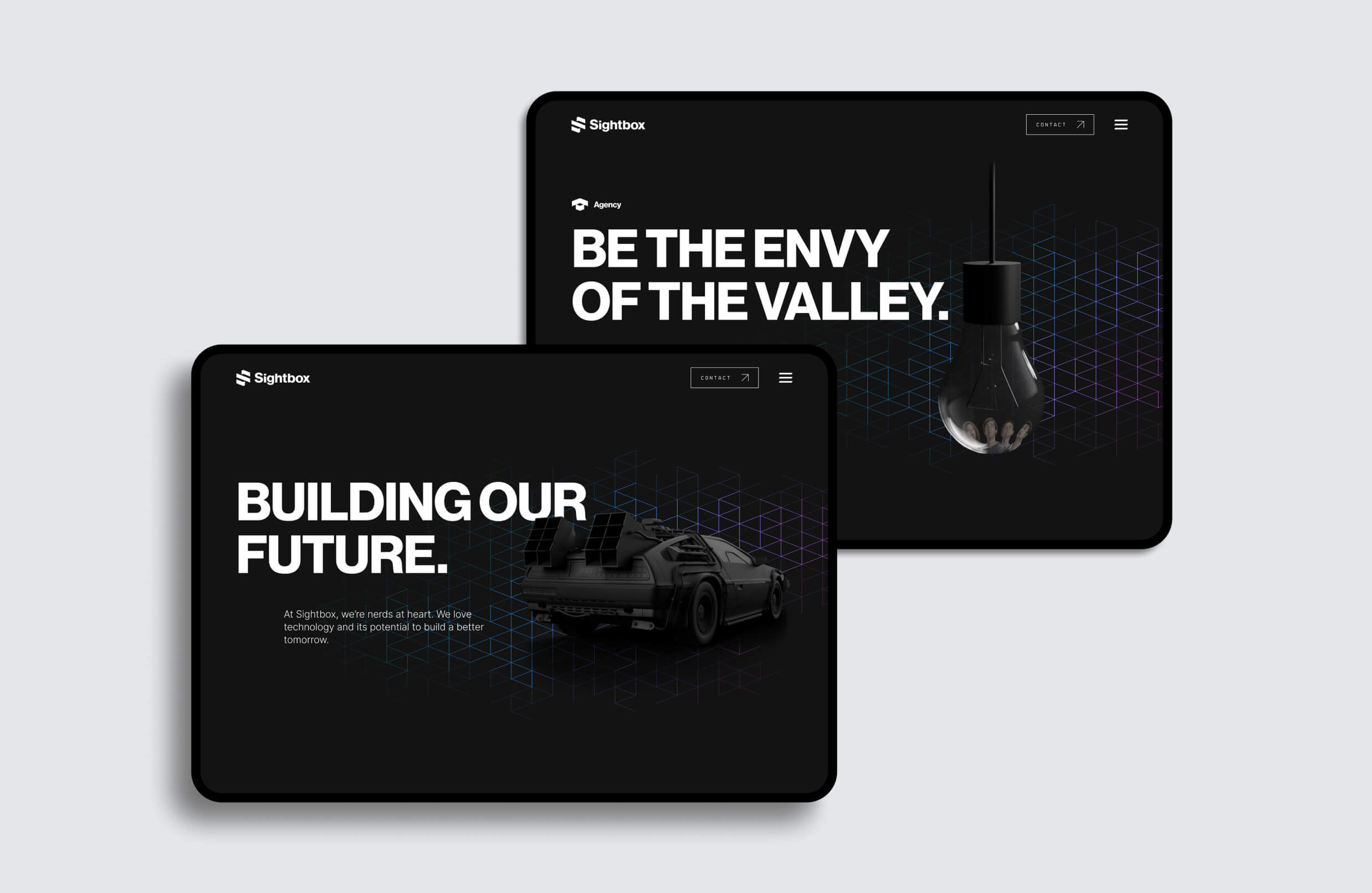
I created 3D assets for each main page hero. Matte black renders with some nods to pop-culture. I applied the same grid used in the logos as a background to the renders. The colours of these grids animate through an iridescent gradient
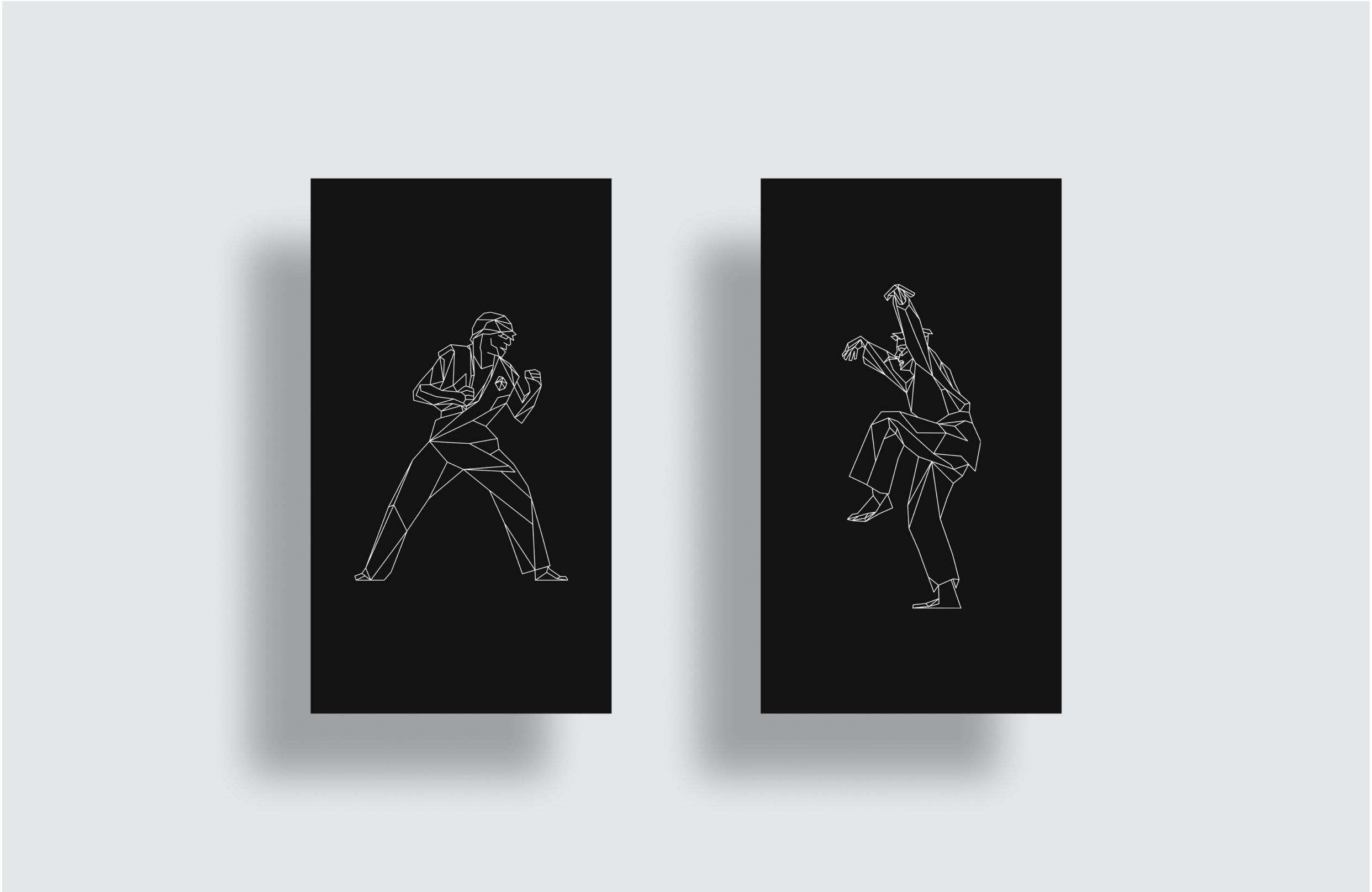
Illustrations &
SVG (Lottie) Animations
Iconography
Social
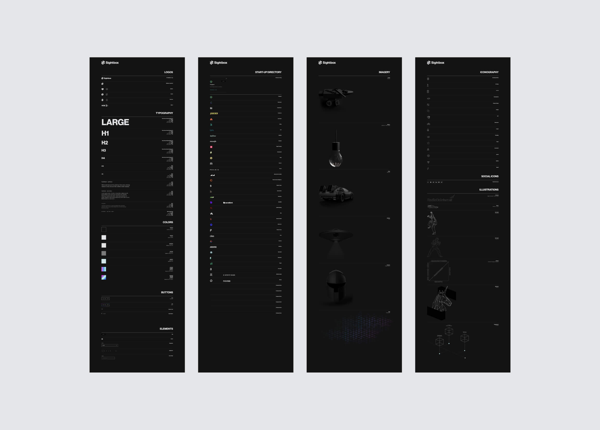
Website Style Guide